Hover Menu
The hover menu can also be configured for most visualizations.
The hover menu provides the option of making additional information available within the visualization. The following options are available to make visualizations more meaningful:
-
Title
-
Description
-
Additional Key Figures
-
Additional visualizations that are filtered based on the basic visualization
-
Images
The following example shows an overview of the suppliers with the most frequent process runs in the bar chart.
By hovering over the corresponding suppliers, the data analyst is provided with additional insights:
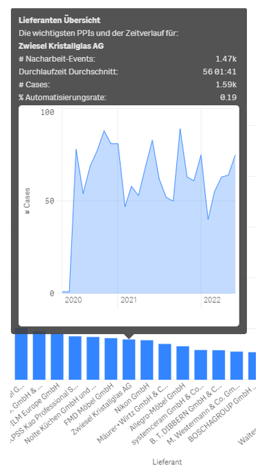
As can be seen in the screenshot, the mouse cursor was moved over the supplier "Zwiesel Kristallglas AG". The pop-up menu predefined by the business analyst now gives the end user the option of obtaining a mini supplier overview.
This enables the end user to see how much rework has taken place at the displayed supplier Zwiesel, how high the average lead time with the supplier is, and how high the automation rate is.
The integrated mini-diagram also shows how business has developed with the displayed supplier in recent years.
The customizability of the context menu means that misinterpretation of data can be counteracted and information that would otherwise have required an additional dashboard can be supplemented accordingly. This can be particularly helpful when mapping relationships that cause strong outliers but may have little relevance in the overall context. (For example, a supplier has a large number of late deliveries in percentage terms. However, by analyzing the context and the course of time, it turns out that the business relationship with the supplier only began during the coronavirus crisis. It is therefore quite possible that the exceptional situation during the coronavirus pandemic has not yet been fully offset by normal business operations )
If you want to know how to define a hover menu, please read here.
Example
One supplier has a large number of late deliveries in percentage terms. However, by analysing the context and the course of time, it turns out that the business relationship with the supplier only began during the coronavirus crisis. It is therefore quite possible that the exceptional situation during the coronavirus pandemic has not yet been fully offset by normal business operations.
The Business Analyst Guide has more information on how to define the context menu of visualization under Basic Configurations.